Hello all and welcome back to the Excel Tip of the Week! This week we have a Creator level post in which we’re going to break down how to make a dynamic schedule visualiser using the powerful dynamic arrays feature.
Dynamic arrays were added to Excel for Microsoft 365 in early 2020; if you’d like a grounding in them check out TOTW #327.
The problem at hand
We are looking at a situation where we have multiple staff and their working patterns over several days:
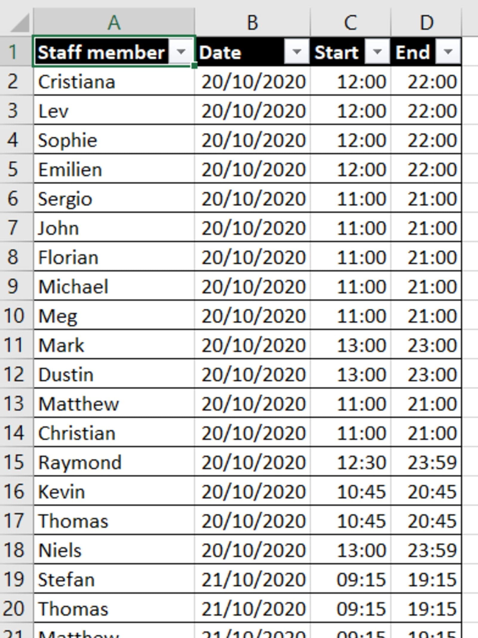
Note that this works for any kind of schedule – we’re using people with date/time here, but it could be machines and dates they’re operating, countries and times they can have meetings, or whatever else.
We want to be able to specify the date we want, and then see at a glance who is working on that day and when. We’re going to use dynamic arrays to make this all completely flexible – so that the visualisation will grow or shrink as needed to include all our staff for each day.
Let’s start by creating the list for the dropdown menu of dates. Our schedule is in an Excel Table named Schedule, so we can use a simple formula to do that:
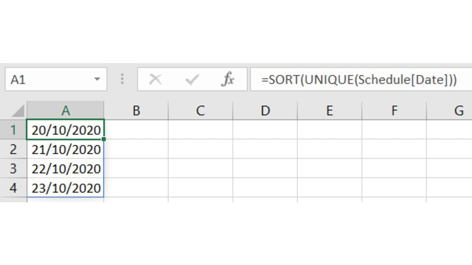
Note that we use SORT here to make sure that the dates are always in order even if somebody sorts the schedule table later on.
Building the visualiser
We start by adding a dropdown to A1, with its source as =Dropdowns!A1#. Note the use of the #-style reference to refer to the entire spilled range of dates that starts at A1.
Our visualiser is going to be built on just three formulas:
- Down column A: A list of the staff, in order according to when they start work
- Across row 1: The times of the day, from the earliest to latest that somebody is on shift, in 15-minute increments
- In between those, the visualisation of the schedule itself
These are all pretty complex formulas, so we’ll take each in turn.
List of staff
Getting the list of staff who are working on the chosen date is simple enough, with just FILTER:
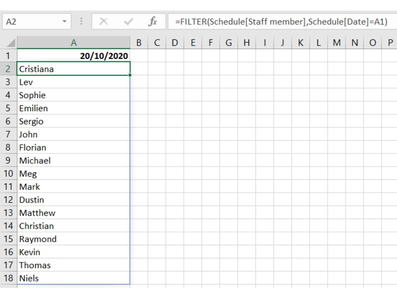
However, this will be in the order they first appear in the schedule. Ideally we want them sorted by shift start time; to do that we use SORTBY and pull out their start times for the chosen date with another FILTER:
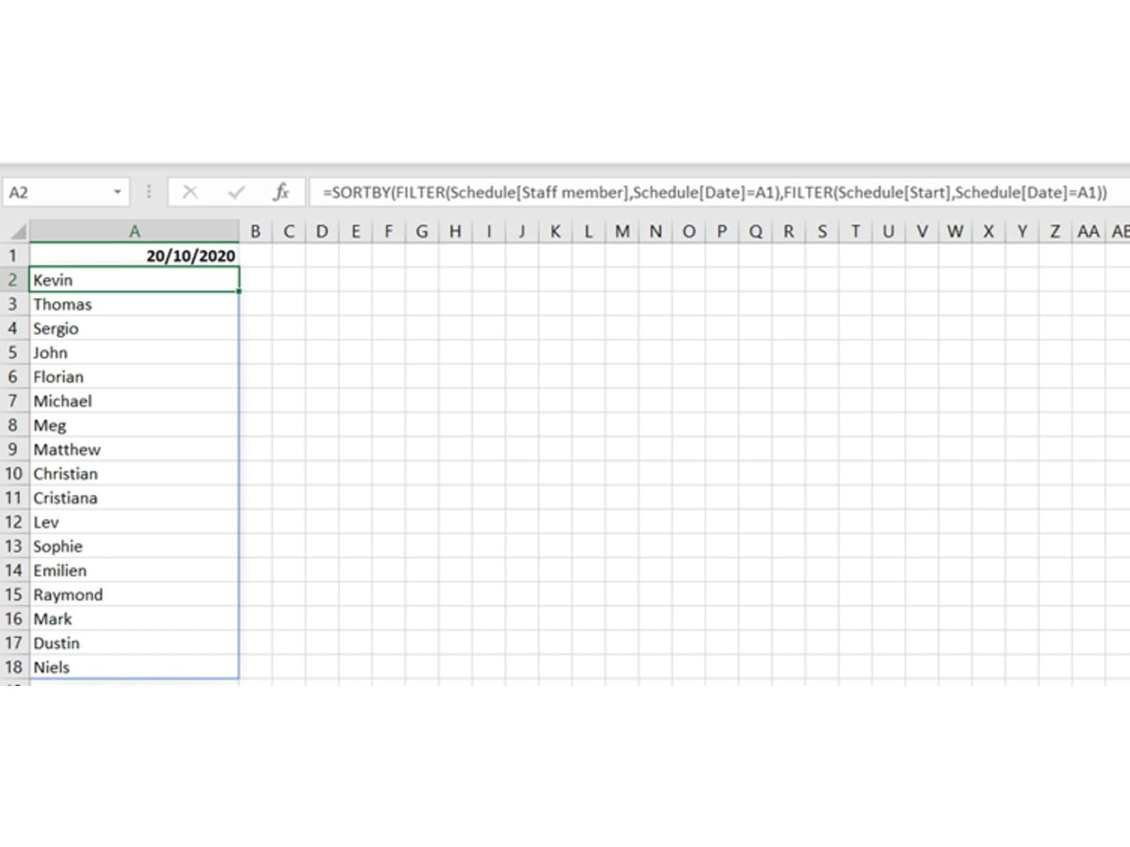
The formula here is:
=SORTBY(FILTER(Schedule[Staff member], Schedule[Date]=A1), FILTER(Schedule[Start], Schedule[Date]=A1))
List of times
Here we are going to need a SEQUENCE function. We’ve chosen fifteen-minute increments for this visualisation. Let’s take each element of the function one at a time:
Rows – This is just a value of 1, as our function is in row 1
Columns – Here we need to calculate the number of 15-minute periods between the start of the earliest shift and the end of the latest one. We can do that with MAXIFS and MINIFS, with a bit of scaling at the end:
(MAXIFS(Schedule[End], Schedule[Date], A1)-MINIFS(Schedule[Start], Schedule[Date], A1))*24*60/15+1
Note that we also add one because we want to include both extremes of the period.
Start – This is just the start of the earliest shift on the specified date:
MINIFS(Schedule[Start], Schedule[Date], A1)
Step – The increment we want – note that we need to scale appropriately to Excel’s date/time schema, where 1 is a full day and 1/24 is an hour, etc.:
The end result looks like this:

That monster formula in full:
=SEQUENCE(1, (MAXIFS(Schedule[End], Schedule[Date], A1)-MINIFS(Schedule[Start], Schedule[Date], A1))*24*60/15+1, MINIFS(Schedule[Start], Schedule[Date], A1), 15/60/24)
The schedule
All our formula needs to do is return 1 if a person is on shift at the given time, and 0 if they aren’t. We’ll use conditional formatting later to make this data visual. To do this, we just check whether any row in the Schedule matches the chosen date and the appropriate staff member, has a start date before or on this column’s time, and an end date on or after this column’s time. That’s done with a COUNTIFS:
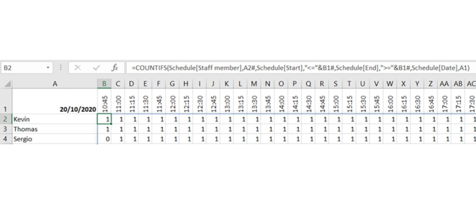
The formula is:
=COUNTIFS(Schedule[Staff member], A2#, Schedule[Start], "<="&B1#, Schedule[End], ">="&B1#, Schedule[Date], A1)
We only need to type this formula in cell B2 – the #-references will then copy it downwards and rightwards as much or as little is needed to fill in the space.
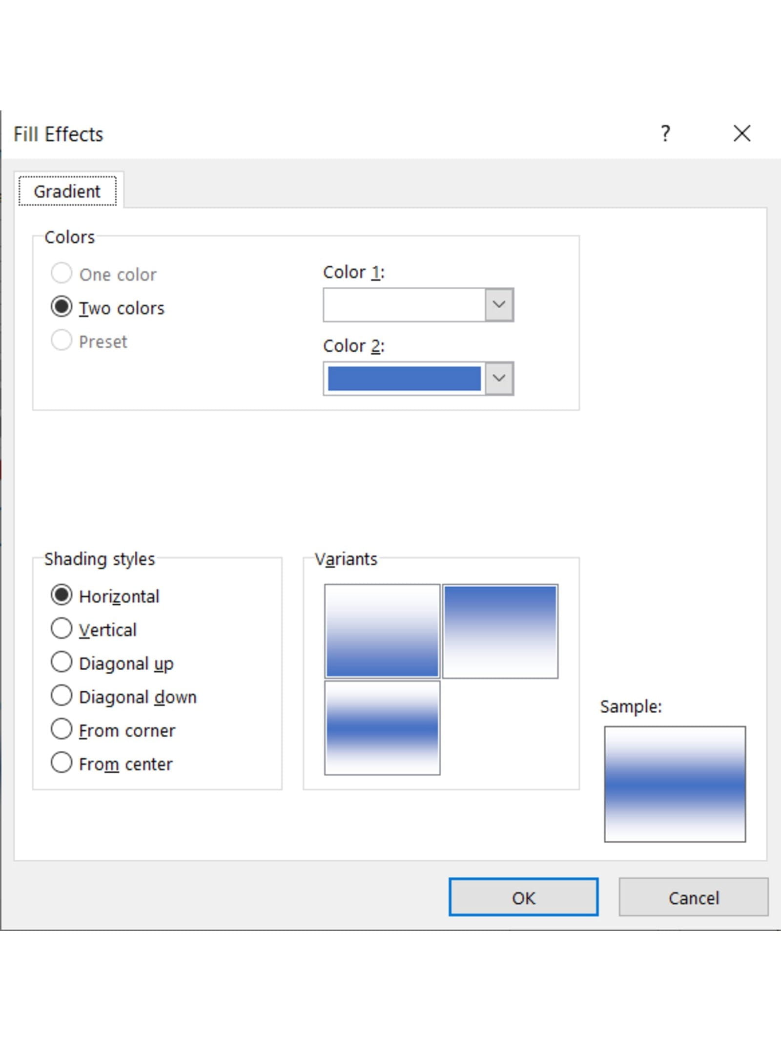
The final step is to turn the sea of 0s and 1s into a visualisation. To do that, we need to do two things: Use conditional formatting to colour the 1 cells, and hide the numbers.
The conditional formatting rule is simple enough – we want to highlight things with a value of 1 – but the resulting format we want is a lesser-used one – we want Fill => Fill Effects and to choose a Horizontal fill – this visually creates a bar which fades to white along the cell:
We combine this with a custom number format of “”, which doesn’t show any values, and we get our finished product:
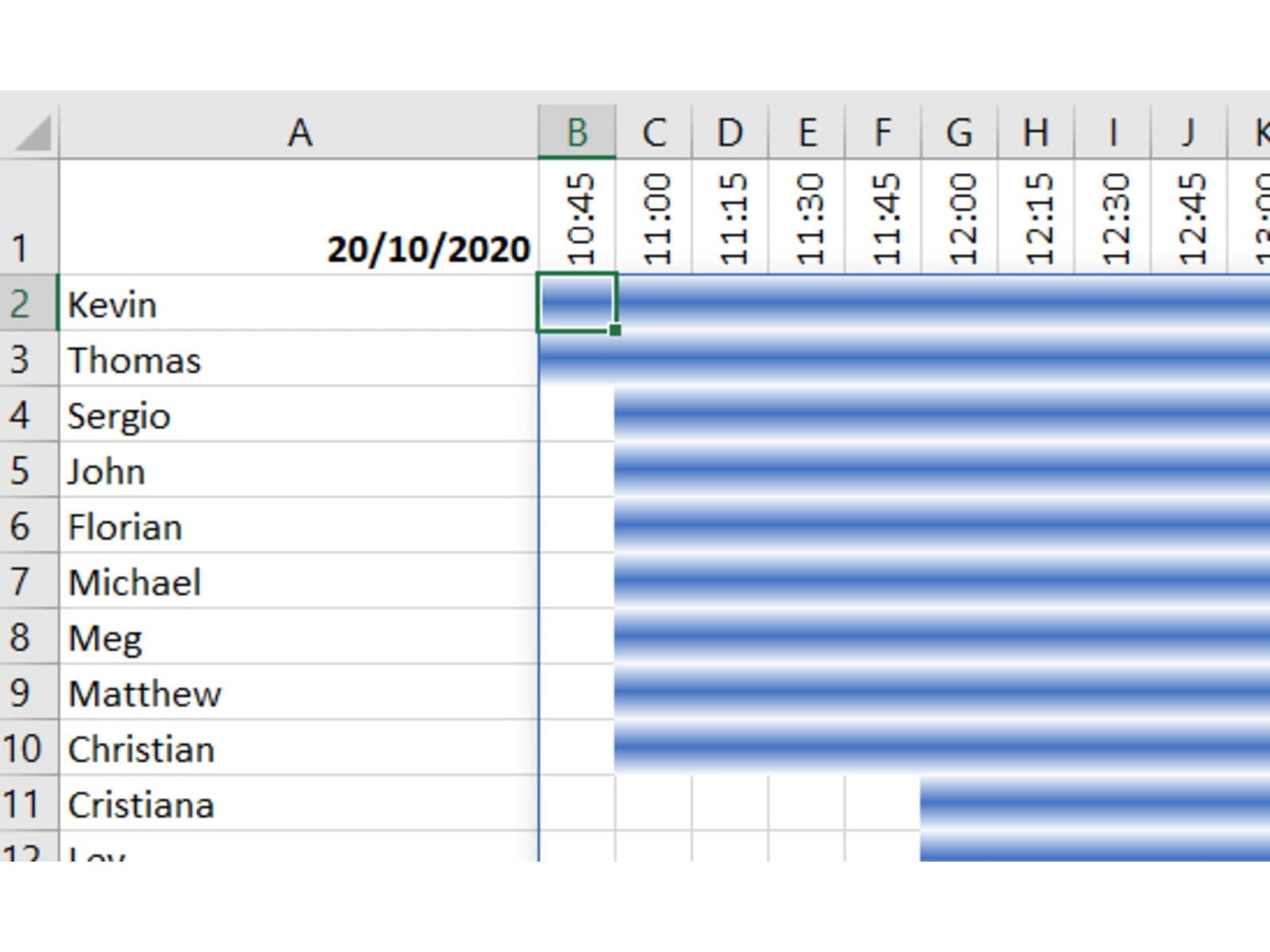
And all of that with just four formulas in the whole workbook!
You can download the template and experiment with it for yourself here.
You may also like
Archive and Knowledge Base
This archive of Excel Community content from the ION platform will allow you to read the content of the articles but the functionality on the pages is limited. The ION search box, tags and navigation buttons on the archived pages will not work. Pages will load more slowly than a live website. You may be able to follow links to other articles but if this does not work, please return to the archive search. You can also search our Knowledge Base for access to all articles, new and archived, organised by topic.

