Hello all and welcome back to the Excel Tip of the Week! This week, we have a Basic User post in which we’re taking a look at how to make your spreadsheets easier to use and understand, with the Accessibility Checker tool.
What is the Accessibility Checker, and what kinds of things does it check for?
Added in Excel 2013, the Accessibility Checker is an automated tool for checking for several common accessibility issues in your spreadsheet that may impede users from using and understanding it. While this includes issues that are specific to disabled users (such as compatibility with screen readers), it also includes some checks which are of relevance to any user (such as low-contrast colour combinations that are hard to read). The checker searches for a long list of possible issues; by their nature these cannot be automatically fixed, but the checker does provide an explanation of the issue and suggestions for fixing it in each case.
If you are making a spreadsheet for public use, running the Accessibility Checker and considering its recommendations is a great way to increase the reach and impact of your work.
Here are the different things that the Accessibility Checker looks for, in several categories.
Errors
Items in this category make accessing your spreadsheet very difficult or impossible for disabled users, and should be reconsidered wherever possible.
Lack of alt-text
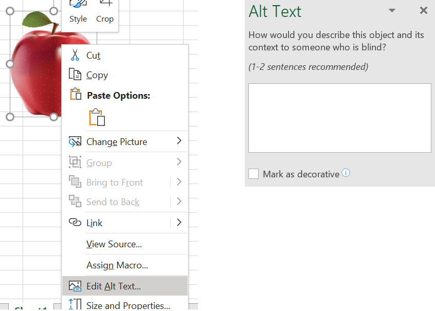
Images and other elements can be assigned alt-text from the right-click menu:

Without this images are inaccessible, so do consider including a brief description for any information-carrying images. Note the ability to mark images as decorative if screen readers should skip them.
Lack of table headers
Screen readers – and indeed regular readers – rely on headers to understand what your tables contain. For screen readers this isn’t just for context, but also to aid with navigation.
Colour-only negative formatting
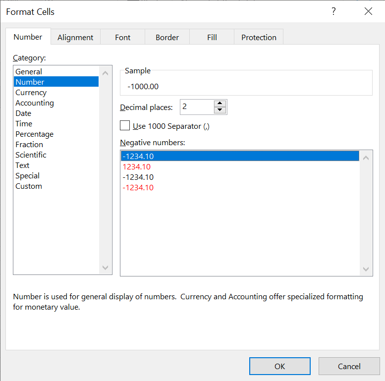
One of the default options in Excel is to indicate negative numbers with red font colour:

This is of course confusing for readers who can’t easily distinguish colours – and there’s no real reason not to use the format which includes the minus sign as well as the red colour.
Note: Communicating information only through colour is generally considered bad practice for accessibility reasons, but the Accessibility Checker cannot detect other instances of this kind of error.
Document is not accessible programmatically
It is possible to disable programmatic access to files (e.g. for data security reasons), but this option will also shut out users of screen readers and other accessibility software. Consider other ways of protecting your data in these cases.
Warnings
Items in this category are usually difficult for users with disabilities, and should be considered.
Non-simple table structures
Again this is to aid screen readers - in Excel, it means no merged cells, which is also a good idea for several other reasons as discussed at length in TOTW #233.
Generic sheet names
Another one that helps all your readers – give your sheets names other than “Sheet1” etc.
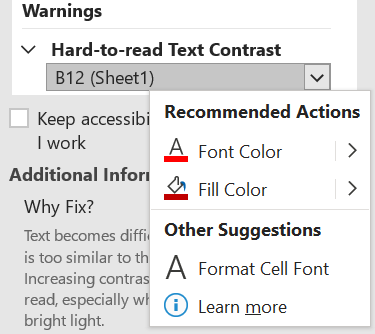
Low contrast between text and background

This kind of text is hard to read for those with low vision.
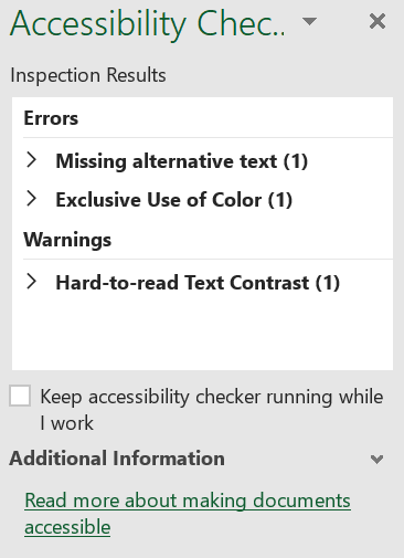
You can run the Accessibility Checker from the Review Ribbon. You get a report like this:

You can expand on these arrows to find where the issues exist, and click on a button to apply a fix where Excel can make one:

As with so many other things in the accessibility space, considering these issues is not only vital for disabled users of your work, but also can improve usability for all your readers. So consider it next time you’re making a spreadsheet for wider distribution.
Excel community
This article is brought to you by the Excel Community where you can find additional extended articles and webinar recordings on a variety of Excel related topics. In addition to live training events, Excel Community members have access to a full suite of online training modules from Excel with Business.

Archive and Knowledge Base
This archive of Excel Community content from the ION platform will allow you to read the content of the articles but the functionality on the pages is limited. The ION search box, tags and navigation buttons on the archived pages will not work. Pages will load more slowly than a live website. You may be able to follow links to other articles but if this does not work, please return to the archive search. You can also search our Knowledge Base for access to all articles, new and archived, organised by topic.

