
In this article, we consider examples of how conditional formatting can be used in practice.
This article was originally published in 2019 as 'Accountants’ guide to Excel – Conditional Formatting: two heads are better'.
It has been edited to reference latest Excel developments.
Conditional formatting
Excel's conditional formatting feature changes the way in which a cell is formatted dynamically, based on the value in that cell and/or other associated cells. The conditional formatting options can be found in the Styles group of the Home Ribbon tab. Different types of formatting are available.
- Highlight Cells Rules highlight the selected cells based on the values that they contain – for example, all cells that contain values above a threshold value can be formatted to stand out from the cells around them. The value can be typed in, or preferably entered into a cell that can be referred to in the conditional format rule.
- Top/Bottom Rules highlight cells that fall within the top or bottom number or percentage of the cells selected. For example, the top ten cells in a range by value or the cells that fall in the bottom 7% of the cells selected.
- Graphical formats. These are almost always applied to a range of cells rather than to individual cells. The three types available are: Data Bars, where the width of the bar within each cell is proportional to the cell's value; Colour Scales which are often used to apply 'heat maps' so that higher value cells are displayed in hotter colours, and Icon Sets which apply one of a set of icons to each cell in a range.
In this article, we will consider a couple of specific examples of how conditional formatting could be used in practice.
Focus attention
When presenting any set of figures, it is often useful to help focus attention on the most significant areas. Any of the conditional formatting types could be used to achieve this, but often at the cost of making the figures themselves a little less easy to read:
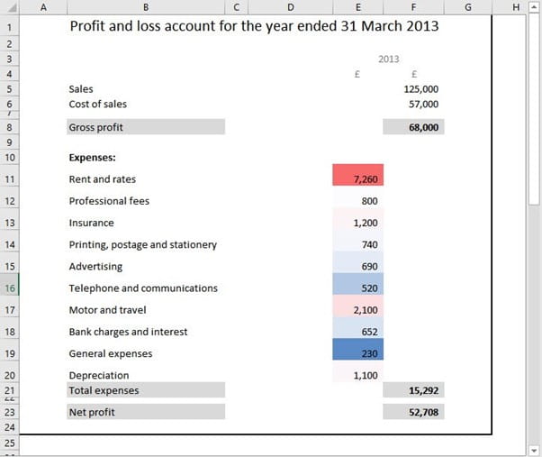
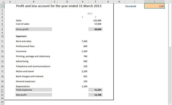
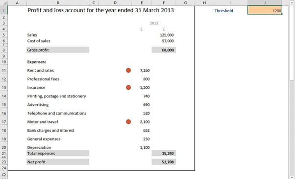
As an alternative, we will use simple red spots to highlight our key values. First of all, we will enter our threshold value in a cell and allocate the Range Name 'Threshold' to it. This cell could contain just a value that we type in, or a formula that calculates our threshold in some way:
Next, we will create a reference in column D to the adjacent expense values in column E. We will then use Home Ribbon tab, Conditional Formatting, Icon Sets to set up 'traffic light' icons for our figures in column D:
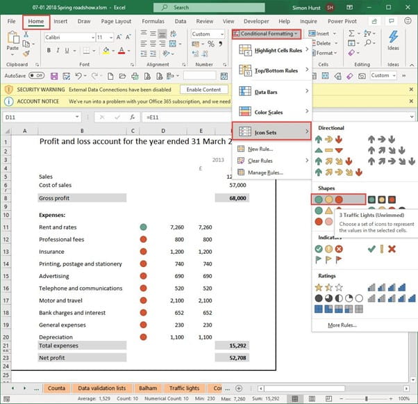
We will use the detailed setting for our Icon Set conditional format to turn this into the approach we are aiming for:
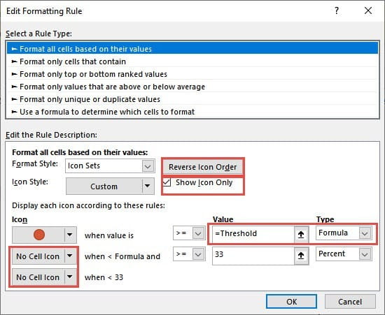
From the Conditional Formatting dropdown, we select Manage Rules, then, if we have more than one rule applied to the selected cells, select the rule that we want to edit and choose Edit Rule. We have changed the following options:
- Reverse Icon Order – this changes from showing Green for the highest value to Red
- Show Icon Only – gets rid of the numbers
- Icon – we leave the top icon as a red spot and change the Type to Formula and set the Value as =Threshold. Note that the use of = is vital, if we were just to enter Threshold, Excel would assume that we were comparing a text value of "Threshold" rather than using our range name. Because we only want to see the red spots, we use the dropdown to set the other two icons to No Cell Icon. The ability to choose individual icons or No Cell Icon was added in Excel 2010.
Finally, we set the alignment for our icon cells using the alignment options in the Home Ribbon tab, Alignment group. We have chosen right alignment:
PivotTable graphics
Before Excel 2007, conditional formatting could only be applied to a range of cells which made it impractical to use with most PivotTables which, by their nature, expand and contract to include different ranges of cells. Excel 2007 introduced the ability to apply conditional formatting to an area of a PivotTable. Perhaps the easiest way to do this is to select a single cell in the PivotTable data area and apply your chosen conditional format. A Formatting Options button will then appear next to the cell, allowing you to choose whether to apply the format to the selected cell or cells, or to a particular area of the PivotTable.
In this example, we have added Data Bars to the data area of the PivotTable, excluding the total rows and columns. We have then set the detailed options in a similar way to that described above in order to turn our PivotTable into a graphical representation of our data:
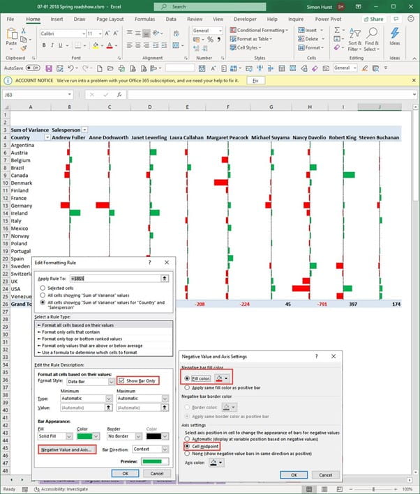
In another 2010 addition, it became possible to choose the colour and positioning of a bar that represents a negative value. So, our red bars show how far below budget any particular value is, with the green bars showing a positive variance.
Pan-Galactic implementations
Avid readers of The Hitchhiker's Guide to the Galaxy will no doubt recognise that the inspiration for conditional formatting came from some particularly clever sunglasses worn by one of the main protagonists on at least one of his heads. You could always adapt this idea to format any cells containing worrying information as black text on a black background in order to protect the peril-sensitive.
Archive and Knowledge Base
This archive of Excel Community content from the ION platform will allow you to read the content of the articles but the functionality on the pages is limited. The ION search box, tags and navigation buttons on the archived pages will not work. Pages will load more slowly than a live website. You may be able to follow links to other articles but if this does not work, please return to the archive search. You can also search our Knowledge Base for access to all articles, new and archived, organised by topic.

