Hello all and welcome back to the Excel Tips & Tricks! This week we have a Creator level post in which we're taking a look at how to make use of the #N/A error to help customise charts.
This was previously covered in Tip #297.
What's the goal?
By default, Excel tries to plot everything in a given range when making a chart - which is obviously what we want as a default. But some types of data make this very awkward.
Let's take the below - a loan calculator with payments each quarter.
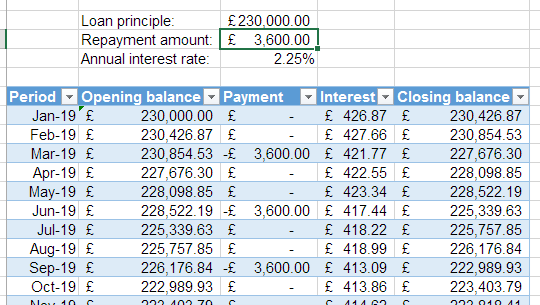
If we want to chart the loan balance over time, we get something like this:
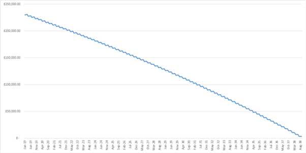
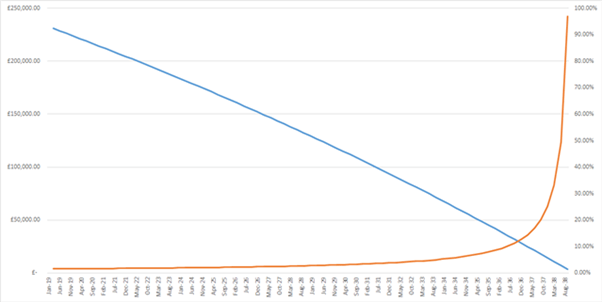
This is accurate, but the 'wiggliness' is distracting - the pattern of payments is quarterly, which creates this. Ideally, we'd like to see the balance decreasing over time based only on the post-payment balances. If we make a secondary axis charting the payment amount as a fraction of the balance, it's even worse:
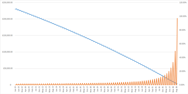
What we want to do is exclude the inter-payment amounts. And the easiest way to do that is to use a helper column that uses an IF to replace any non-payment month balances with an #N/A error - because these values aren't plotted on charts. We don't want "N/A" as text here - we want the error function, which is easy to generate directly with the function NA().
Here are our helper columns:
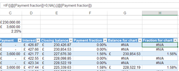
And here is our resulting chart, with the data now being taken from the helper columns:
But wait, there's more
As well as skipping certain values, you can also use #N/A errors to filter which axis dates are plotted at all.
Let's say that we only want to chart the portion of the loan where the balance is between £125,000 and £25,000. We can create one final helper column that reproduces the axis labels only under this condition and returns #N/A otherwise. And just like that, the chart is dynamically filtered:
Knowing how to use #N/A to mark empty cells is particularly powerful when the charts need to be flexible for timing. More examples on this have been covered in Tip #171.
Overriding the default
We now know that if you create charts in Excel with a dataset with #N/A errors, Excel will ignore the errors and will connect all the datapoints by default. While the default may be what we want, it can also be handy to know how to override this setting.
You can do this by navigating to ‘Select Data’ in ‘Chart tools’ where you can select the ‘Hidden and Empty Cell Settings’ option to open up a menu as below. Here you can select the option to ‘Show #N/A as an empty cell’.
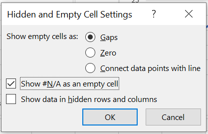
With this setting any missing datapoints or errors will appear as gaps in the chart.

Archive and Knowledge Base
This archive of Excel Community content from the ION platform will allow you to read the content of the articles but the functionality on the pages is limited. The ION search box, tags and navigation buttons on the archived pages will not work. Pages will load more slowly than a live website. You may be able to follow links to other articles but if this does not work, please return to the archive search. You can also search our Knowledge Base for access to all articles, new and archived, organised by topic.

