This is the first article of a series that supports the lunch and learn webinars that will show you how to bring the financial reports alive in Excel with visualization. This article will explore the journey from raw data to actionable insights.
- ‘Excel Lunch and Learn series: Visualisation with Excel’ webinar recordings now available.
This series of articles supports the lunch and learn webinars that will show you how to bring financial reports alive in Excel with visualisation. These articles will explain some of the background and key stages to each session as well as answer questions that were raised during the webinar.
The essence of the series is turning data into actionable insights for management and the board, some may have Numerophobia, no financial training or a visual learning style. We need to make the interpretation of data easy and able to support effective decision making.
The first CFO I worked for told me to make sure my monthly reports ‘spread light not generate heat’. Perhaps visualisation can provide an effective way of fulfilling that aim.
ASC Ehrenberg's Theory of Data Reduction
We will explore a number of his principles in the blog series and start with three here:
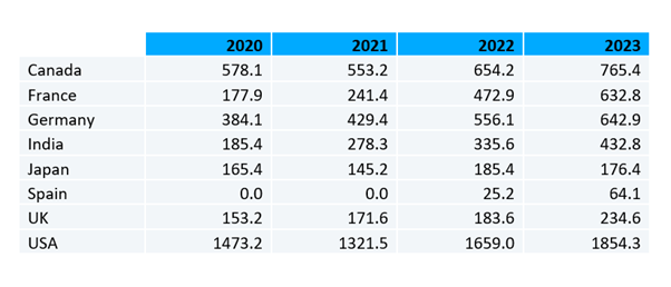
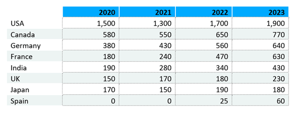
Two significant digits - He asserts that you only need two digits (significant figures) to make a decision. For example, if you had a project that could generate £1.4m you would not make a different decision if you knew it to be £1.432m. Therefore, in any commentary ignore the detail - keep the numbers simple. An additional benefit of two significant digits is that they are more memorable. You can hold in your head around 12 two digit numbers – last month’s revenue, profit, cash balance and so on. You will be able to recall the numbers in meetings later that month when financial context is needed.
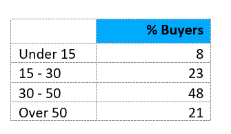
Sort tables by the critical factor - It can be much easier to read tables if they are sorted such that the top few items of data convey the critical information.

The Series
To create the visualisations, we will use many of the Chart options in Excel and apply an array of graphical choices and features that are available. We will begin with traffic lights that can highlight underperforming areas of the business, through to speedometers that illustrate achievement of KPIs.
Blog 2 – Charting monthly results
Blog 3 – Waterfall charts
Blog 4 – Speedometers
Blog 5 – Building the report and adding commentary
Traffic Lights
How often do we produce our management accounts pack, the same format as last month, a growing number of pages (rarely thinned out) and ever stand back and ask – How useful is all this?
Take the following example:
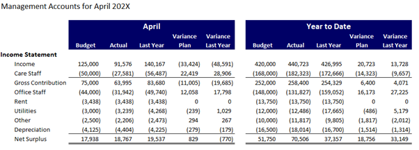
To start with, we take it for granted that everyone will understand what the brackets mean around variances, and they can determine whether its better with brackets or without them. You may be surprised at how few people are confident with this format.
By adding traffic lights will quickly highlight the variances that are good, OK or bad.
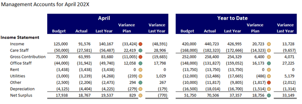
Calibrating the traffic lights is important so that the number of red ones is only a handful thus directing attention towards the key issues.
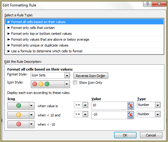
In this case we are using:

The webinar will show you how to build this, but the key steps are:
Variance – this is calculated by taking Actual – Budget thus positives are good news and negatives are bad news.
Variance percentage – this is calculated by taking Variance / ABS(Budget)*100. The =ABS() function removes the sign from the contents of the brackets. The answer will always be a positive number, this prevents a positive variance divided by a negative budget value showing as a negative percentage. The answer is multiplied by 100 to turn the answer into a whole number rather than a fraction.
Traffic Lights - use the conditional formation function (icon the Home Ribbon) and select Icon Sets. Here you will find a range of Traffic light options and these can be calibrated as below to the range where you want them applied.
You will also notice in the middle of the dialog box there is check box for ‘Show Icon Only’. This will replace the variance number with a traffic light rather than displaying both in the cell. This can be helpful in reducing the number of columns displayed to avoid shrinking the report to enable it to fit on a single page.
Questions from the webinar
Where questions are answered in a webinar or a blog later in the series they will not be covered here. The two from this webinar to cover are:
Column order – someone asked whether the first column in the management accounts should be budget or actual. I don’t think there is a right or wrong here. I usually start with budget as this was the original plan set by the board before the year began, it aligns to the medium term plan and therefore the management accounts is primarily reporting – ‘are we on track’.
Traffic lights for those with colour blindness – to avoid mistakes it can be helpful to use the shaped version – green in a circle, yellow in a triangle and red in a diamond. I display below all the options currently available.

- Bringing financial reports alive in Excel with visualisation
- Bringing financial reports alive in Excel with visualisation – visualising monthly results
- Bringing financial reports alive in Excel with visualisation – comparing data sets
- Bringing financial reports alive in Excel with visualisation – speedometers
- Bringing financial reports alive in Excel with visualisation – building the report
Archive and Knowledge Base
This archive of Excel Community content from the ION platform will allow you to read the content of the articles but the functionality on the pages is limited. The ION search box, tags and navigation buttons on the archived pages will not work. Pages will load more slowly than a live website. You may be able to follow links to other articles but if this does not work, please return to the archive search. You can also search our Knowledge Base for access to all articles, new and archived, organised by topic.

