
Introduction
In a recent Tips and Tricks article we covered an introduction to the basics of charts in Excel.
In this article we will take this knowledge a step further by introducing the concept of a combo chart.
For anyone wishing to follow along we include an Excel file for download with all the examples in this article:
What is a combo chart?
Combo charts naturally arise when we would like to consider two or more data series that are fundamentally different but can be compared in a meaningful way.
Let’s start with a simple example. Here we have data from an ice cream vendor showing ice cream sales vs number of sunny days in a given month.
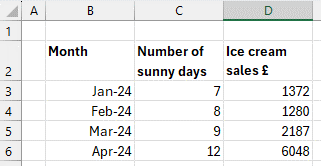
We would like to plot this information on the same chart but notice how number of sunny days is quite a low range (7 – 12) and ice cream sales is quite a high range (1280 – 6048).
A combo chart is our friend here as it allows us to create a secondary axis for the second data range.
We can insert a combo chart by selected the data, going to the Insert tab on the ribbon, and clicking the drop down next to the combo chart icon.
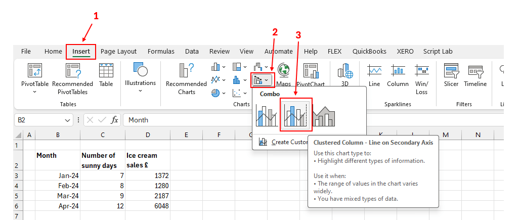
Here we have chosen the second combo chart option, as this provides us with the secondary axis as desired.
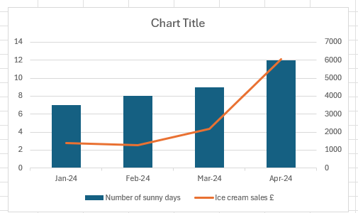
Here we can see number of sunny days shown as a column chart (with the appropriate range shown as the primary axis on the left-hand side) and ice cream sales shown as a line chart (with the appropriate range shown as the secondary axis on the right-hand side).
By using a combo chart, we have can emphasise that we are dealing with distinct types of data while at the same time providing a meaningful visualisation to compare the two.
Combo charts with financial data
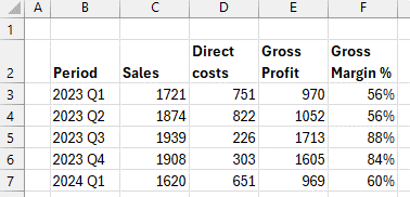
For a more typical finance and accounting example let’s say we would like to create a chart showing recent sales and costs over time and see how that compares with gross profit margin.
Again, we have a simple layout of data as follows:
Let’s select the data and insert a combo chart in the same way as above.
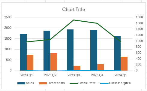
Looking at this graph it is impossible to see the Gross Margin data. This is because Excel has guessed that we want to plot the first two data series (Sales, Direct costs) as column charts against the primary axis on the left hand side, and the second two series (Gross Profit, Gross Margin %) as line charts against the secondary axis on the right hand side.
As the Gross Margin data is a percentage it is plotted as a value between 0 and 1 and hence just a flat line on the floor. It needs to have its own axis that can be scaled appropriately.
To correct this, we can select the chart and go to the “Change Chart Type” dialog box.

This shows us exactly which chart types have been chosen for each data series, and whether or not they are plotted on the secondary axis.

Let’s change the Gross Profit chart type to “Clustered Column” and uncheck the “Secondary Axis” box so that it is consistent with the Sales and Direct costs data series.
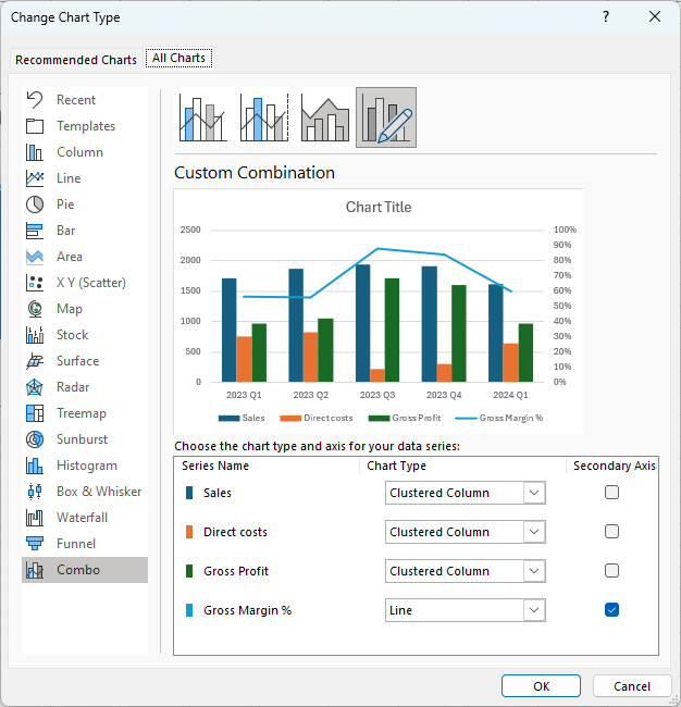
This leaves Gross Margin % separately identifiable as a line chart and the only data series plotted in reference to the secondary axis.
Now close the dialog and we’ll see our chart updated.
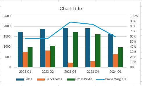
Notice how the secondary axis has automatically been scaled to show values between 0 and 1 and the axis markings have been formatted as percentages.
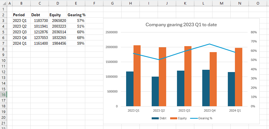
Tip! Consider using this chart type to plot other financial metrics. For example, we could use the identical process to look at how a company’s gearing ratio (defined as debt / equity) changes over time:
Same chart, different axis
A combo chart can also include charts of the same type, but the context of each data series is different.
An example of when this might be useful would be comparing a company’s sales over time with the overall industry figures.
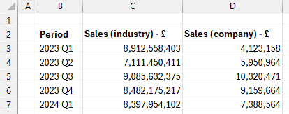
The company’s individual sales will fall within a much smaller range compared to the industry as a whole, as shown in the data below:
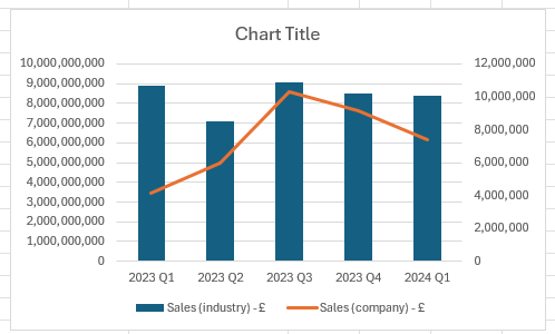
Plotting this as a combo chart produces the following:
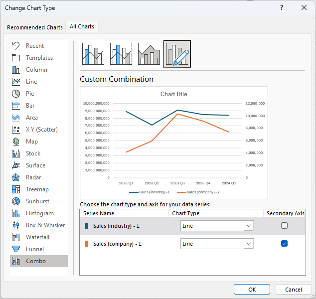
As we are considering the same type of data in for both series (sales expressed in £) let’s use the same chart for both series.
With the chart selected let’s go back into the “Change Chart Type” dialog and choose “Line” chart for the Sales (industry) data.
Returning to our chart we can now see both series plotted as line charts.
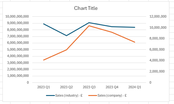
By taking advantage of a secondary axis, we can see at a glance if the company’s sales have grown or shrunk compared with the industry as a whole.
Conclusion
Combo charts are a great way of comparing varied data on the same chart. They go beyond the scope of a simple chart by allowing multiple chart types to be plotted in the same area, with the option for a secondary axis where appropriate.
While we have only considered column and line charts in this article, there is plenty of scope to take this idea further. Within the Change Chart Type dialog, we can set up combo charts to combine Column, Bar, Line, Area, Pie, Scatter or Radar charts. Although not all combinations will work together there is lots to explore!
Archive and Knowledge Base
This archive of Excel Community content from the ION platform will allow you to read the content of the articles but the functionality on the pages is limited. The ION search box, tags and navigation buttons on the archived pages will not work. Pages will load more slowly than a live website. You may be able to follow links to other articles but if this does not work, please return to the archive search. You can also search our Knowledge Base for access to all articles, new and archived, organised by topic.
