Introduction
This rare excursion to the world outside of Excel was inspired by a query from a client. They had converted a PDF file to a Word document using Word’s built in PDF convertor. Although conversions from simple documents, with little formatting, usually work well, the more complicated the formatting in the PDF, the more likely Word is to make some strange decisions in its attempt to convert it into an editable Word document. In this case, the original PDF was a form with multiple columns, and areas for text to be entered and, crucially, dotted underlines to prompt for the text entries.
Now you don’t
In order to get these underlines in the right place, the conversion created a single transparent ‘picture’ of all the dotted underlines on the page. This picture extended across the entire page. The existing text on the page had been entered using multiple columns. The combination of these two conversion methods meant that, if you clicked on the place in the page where you wanted to type text into the form, instead of being able to enter any text, you would just select the background picture. This made it seem impossible to enter any text. In fact, if you clicked exactly in the right position, just to the left of the paragraph marks, you could enter the text you required. Of course, not being able to see the paragraph marks would make this tricky.
One click to show them all
Over the years, I have created and edited a substantial number of Word documents for newsletters, manuals, course notes and even a book. Most of these documents involved lots of graphics together with reasonably complicated formatting. One of the first things I learnt to do was to always work with Words ‘hidden formatting symbols’ and text boundaries, visible. This made it much easier to understand what was going on when Word positioned text or graphics in seemingly random ways. This is useful when working on your own documents, but possibly crucial when wrestling with a document created by someone else.
When running Word courses, I have found that suggesting to people that they work with these symbols visible has been remarkably controversial. Course delegates often refuse to contemplate the possibility of using Word with so much ‘clutter’ present. I usually plead with them to give it a try for a few hours in the hope that they will at least get used to the added symbols and might even start finding out just how useful they are.
To give an example, many Word users are not necessarily aware of the most efficient way of using even the most basic formatting within Word. If they need to line up content, rather than using tabs, indents or a table, they might just use the space bar. This can appear to do the job but, as soon as someone makes a change, the text alignment can quickly go wrong.
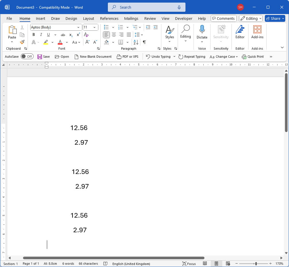
Here’s a section of a Word document with the content roughly aligned in three different ways and with text boundaries and the formatting symbols all hidden:

It’s very difficult to see that each of the three pairs of numbers has been aligned differently but, if we enter some text to the left on the same line, each pair will behave differently, for no apparent reason.
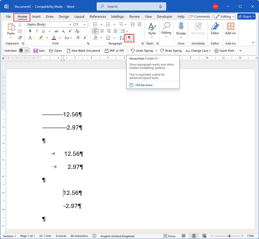
We can toggle our formatting symbols on or off by clicking on the paragraph symbol in the Paragraph group of the Home Ribbon tab, or by using the Control+Shift+8 keyboard shortcut:

Now it’s pretty obvious that the first pair of numbers has been aligned using the space bar to enter a number of spaces. This is unlikely to lead to perfect alignment and requires pressing the space bar lots of times to line the numbers up in the first place, and to adjust the alignment if you need to enter any text to the left. While we’re being controversial, if you ever press the space bar more than once at a time in word, you’re probably doing something inefficiently.
Our second pair of figures has been set up using a decimal tab which means we could enter (short) text to the left without affecting the alignment.
The third pair uses a combination of a full indent and the space bar again, and any text entered to the left would appear immediately to the left of the numbers (or spaces on the second line), rather than at the left-hand margin.
If you were trying to edit this document, the one click needed to display the formatting symbols would make it dramatically easier to sort out any issues.
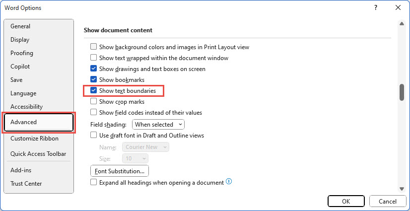
We also mentioned the display of text boundaries. The option to toggle this one or off is slightly more difficult to find. The required option is in Word Options, Advanced, Show document content section:

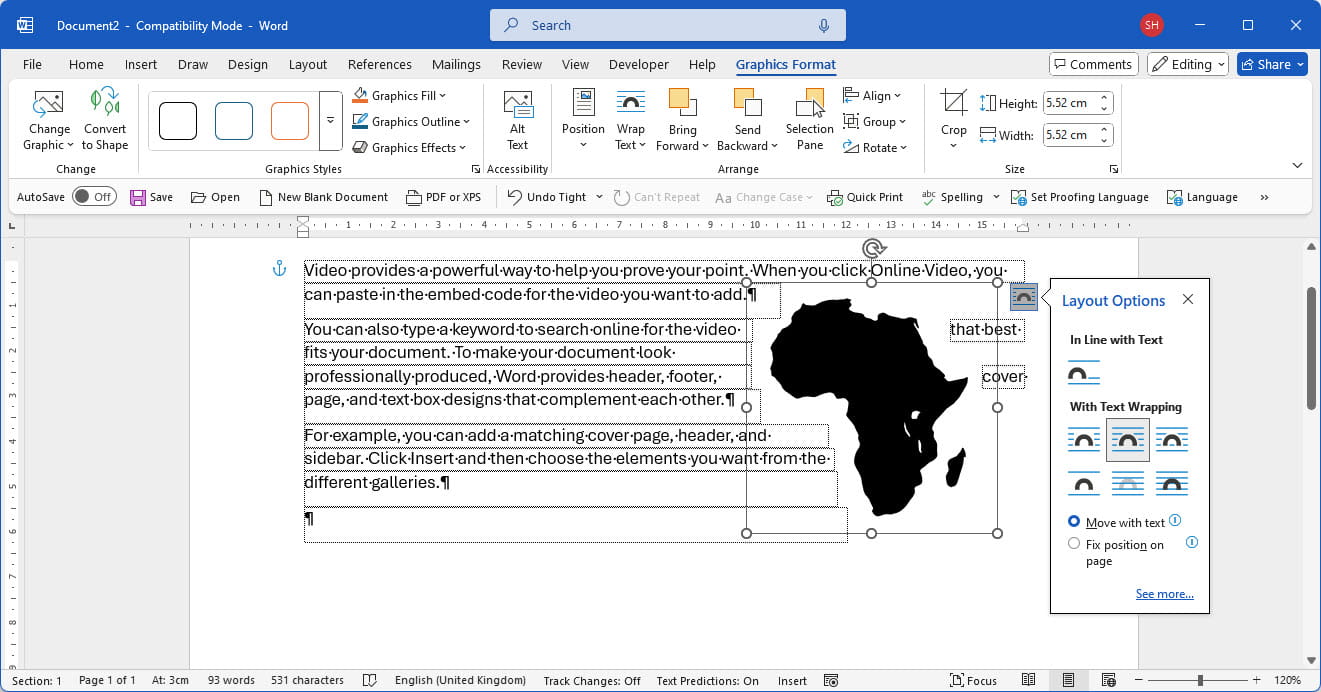
Displaying text boundaries can be particularly useful when working with columns or graphics as it can help show how text will wrap around objects and illustrations:

Conclusion
However much you think you hate the formatting symbols, they can provide enormous benefits when working on your own documents and are close to being essential when working on any other documents. Particularly if you’re having problems with a Word document, turning them on should be the first thing you do. Give them a try – they’re only a click away…
Additional resources
You can explore all aspects of Excel, and several articles on other office applications, in the ICAEW archive
Archive and Knowledge Base
This archive of Excel Community content from the ION platform will allow you to read the content of the articles but the functionality on the pages is limited. The ION search box, tags and navigation buttons on the archived pages will not work. Pages will load more slowly than a live website. You may be able to follow links to other articles but if this does not work, please return to the archive search. You can also search our Knowledge Base for access to all articles, new and archived, organised by topic.

