This article is part of a series that supports the lunch and learn webinars on how to bring financial reports alive in Excel with visualisation. This second article will explore how to visualise monthly results with a range of charts and chart features in Excel.
Charting Monthly Results
In this second article we will look at ways to bring numbers alive with a range of charts and chart features. As Arthur Brisbane said in 1911 “Use a picture. It’s worth a thousand words”. In this case a chart will reduce some of the script that would otherwise be needed to explain monthly performance.
ASC Ehrenberg's Theory of Data Reduction
As mentioned in the first article ASC Ehrenberg has some wonderful principles to make data come alive. Two more of these are as follows:
His view on charts as “a means of making results clear and memorable though not good for communicating quantitative details or complex storylines. A chart should be easy on the eye and the message it portrays should be capable of being summarised in a sentence”. That final part ‘the message being able to be summarised in the sentence’ is a great test as to whether a chart adds value. All too often a reader is left trying to decipher what a chart is conveying and is perhaps no better off for its inclusion.
He also suggests “no more than three colours”. The reason for this is the inability of our brain to interpret four or more colours without having to constantly refer to the legend to check what each colour means.
Starting point
As we go through charting in this and later articles, we will be assuming that readers are able to draw a line chart and are familiar with right clicking the part of the chart where they want to make changes (formatting or data). As such we will primarily be looking at data visualisation not the details of each of the Excel charting ribbons.
Quick Charting
However, on the way through we will just touch upon what is known as Quick Charting. This will allow you to create charts more quickly than other methods. It’s all about structuring your data correctly.
If you highlight B4:N6 in the data below and then click on a line chart it will draw almost everything where you are likely to want it.


The key to this is having the top left cell blank. Excel automatically assumes the top row is the Horizontal Axis Labels, the words in column B are the legend and two lines will be drawn.
If the top left cell said ‘Months’ and the months were numbered 1, 2, 3 … (instead of the three letters Jan, Feb, Mar…) then Excel would assume you wanted three lines drawn and of course the Months line would be tracking the horizontal axis with such low values compared to the other two lines.
When entering the chart title avoid typing it into the text box that is shown, particularly if you are going to update the text each month (perhaps you will be including the month name). Instead highlight the words Chart Title and in the formula bar enter = and then click the cell where you would like it linked. Each time the cell text changes then so will the chart title.
On the vertical axis you will see that the display format is in thousands. If this were millions it would display a lot of unnecessary zeros. A much tidier way to display this is to right click the axis and select Format Axis. In the right-hand column, you will see a drop-down box for Display units to use. In this case we will switch this to thousands. The word will appear in a vertical text box to which a currency symbol can be added.


To add a data table at the bottom of the chart highlight the chart and to the top right three icons will appear. Click on the green plus at the top and a list of available Chart elements is shown. Select the data table and the grid will appear. You can use this menu selection in the same way as the icon ‘Add Chart Element’ which is on the left of Chart Design Ribbon.

Lines hanging or drop to zero?

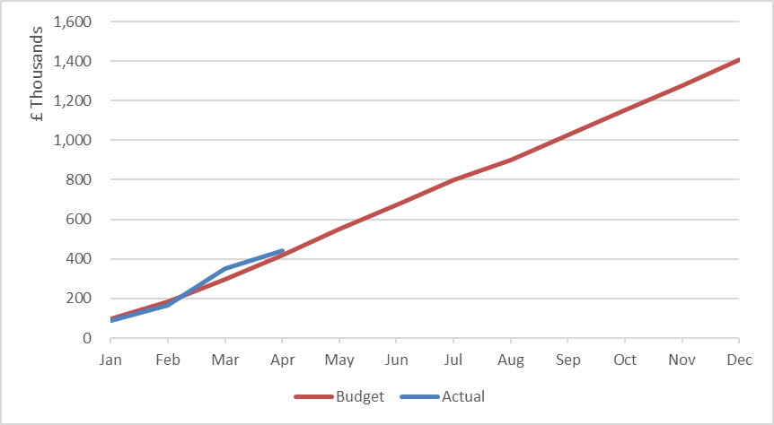
In the above chart, data for the current year is only known up to April so the chart has been prepared with the remainder of the year as a series of zeros. Actual values will be added once known and the line will gradually extend.
However, this style can often raise concern – ‘Why are you predicting that we plummet to zero next month?’
A better way to display this is to make the line hang when the data runs out. This is achieved with the function:
=NA()It does not look very elegant in the data set but works effectively. In the example below the data is collected in row 5. The chart is drawn from the data in rows 15 and 16. In Row 15 a formula is used to test if any data is available, if not the =NA() function will be used. So, in column H (May) the formula is:
=IF(H5>0,H5,NA())As new data is added in row 5 the line will automatically extend.

The result is as follows:
Dual Axis
This type of presentation is very helpful to correlate two related data sets. For example, total payroll cost and head count.
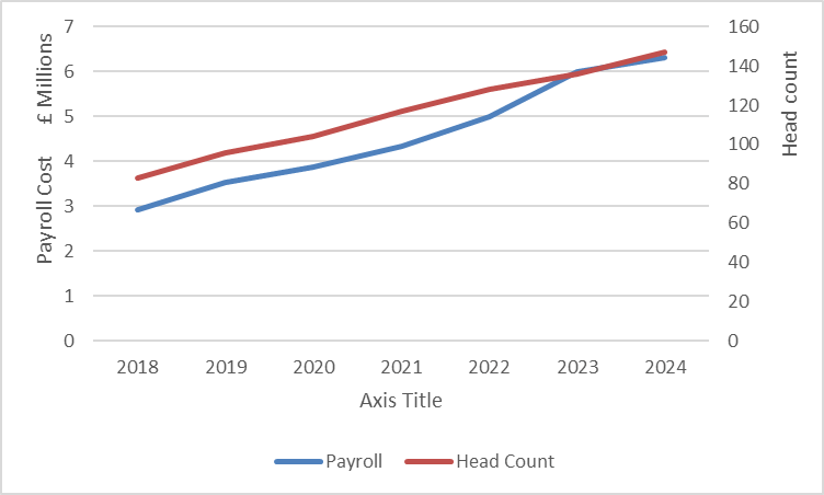
As can be seen the payroll amount is in millions and the head count is in tens.
To create this chart, start with quick charting (as above) to plot the two lines with a single axis. The head count numbers will effectively be tracking the horizontal axis.
Click on the legend and then click just the head count line in the legend. Right click and select the option to Format Data Series. In the menus on the right-hand side will be the option to plot the series on a Secondary Axis. An alternative to clicking the legend is to click on the line itself, but it can be difficult to isolate the line menus from the horizontal axis menus.

Column Charts and Mixed Charts
Take the following data – how could we display this in a helpful and interesting way?

A simple block chart never quite works in making it interesting.

Perhaps it looks more like a picket fence than a helpful chart and thus it can be difficult to pull out the key message.
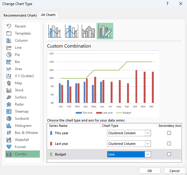
A mixed chart can make it easier to see what the data is conveying. The budget becomes a line. We can also go on to group the two remaining columns together for easier comparison.
To mix the formats – right click any of the columns and select Change Series chart Type. In the dialog box change the budget to a line chart.
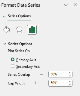
To group the remaining two columns together you need to change their width and overlap. Firstly, right click any one of them and then select Format Data Series. I normally set Series Overlap and Gap Width to both be 50%.
The result is:
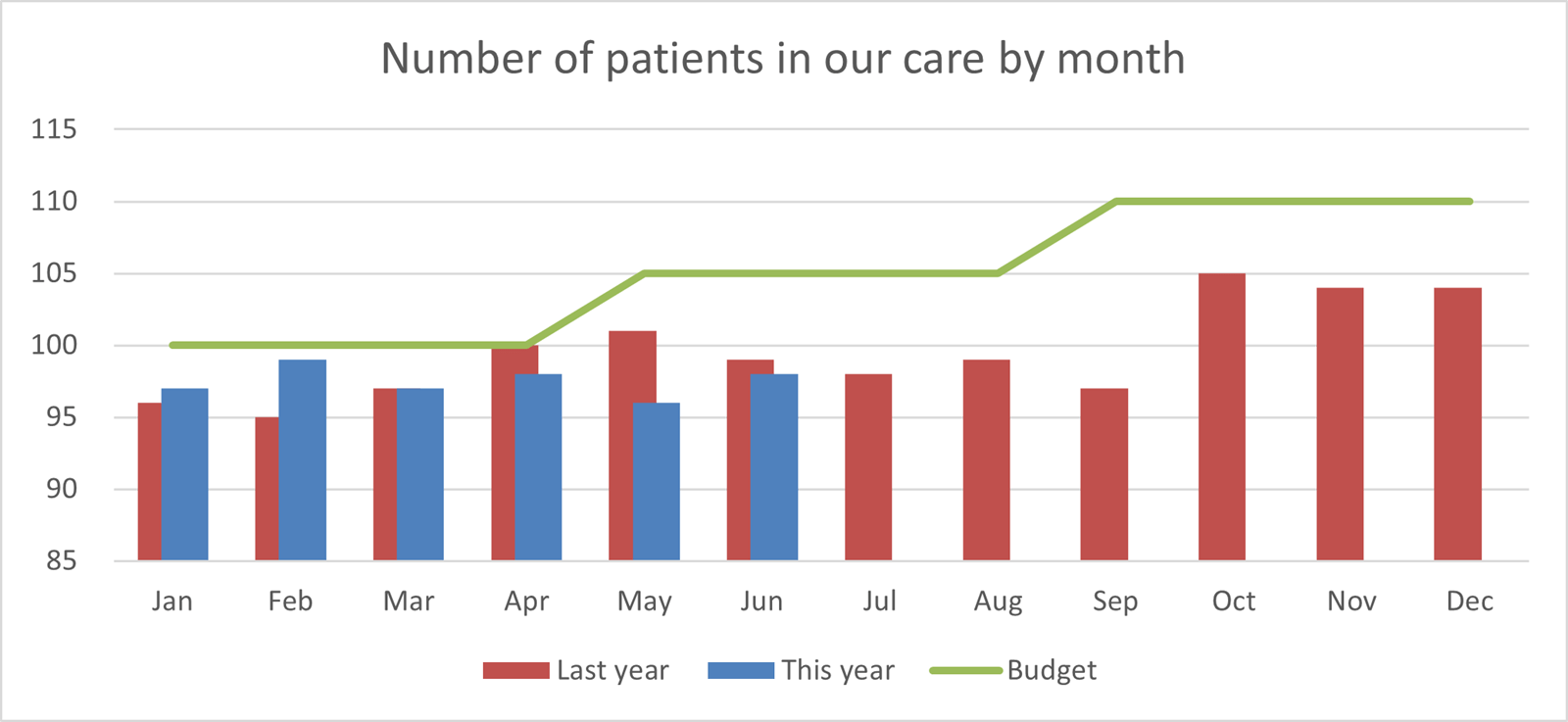
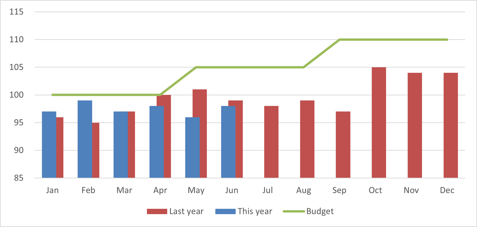
Currently the column at the back (Last year in red) is offset to the left. There may be instances when you would prefer this to be on the right.
To do this you need to take two steps. Firstly, reverse the data order – starting with Dec and working across to Jan.

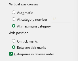
Secondly, when drawing the chart in the same manner as above right click the horizontal axis and select Format Axis. Near the bottom of the list of options will be a tick box – Categories in reverse order.
Initially this will put the vertical axis on the right of the chart and to move it back to the left of the chart there is a selector a little higher up the menu. Select the Vertical Axis Crosses option At maximum category.
The result is:
Picture fill
Instead of colour blocks on the charts it is possible to turn these into pictures. They may not be appropriate for many instances but easily achieved.

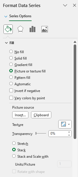
Draw a normal column chart and then right click any one of the columns. Select Format Data Series and at the top choose the tipping paint pot to provide the Fill Options.
Halfway down is the option Picture then further down there is the Picture source option. Selecting Insert allows you to use your own image or search online.
There are three ways of presenting the image:
- Stretch – will expand the shape to fill the column, usually distorting the image in the process
- Stack – (which has been used above) this maintains the aspect ratio of the image
- Stack and Scale – this will fit a defined number of images in each column and stretch them to fit
Questions from the webinar
There was one question raised that is not already covered above or will be covered elsewhere in the series.
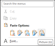
How to copy a chart to a report without making it an active editable spreadsheet extract.
The answer is to right click the chart and click Copy. On the other application (such as PowerPoint) paste as a Picture (the icon on the right of the five options). This will embed the chart as an image which is un-editable.
- Bringing financial reports alive in Excel with visualisation
- Bringing financial reports alive in Excel with visualisation – visualising monthly results
- Bringing financial reports alive in Excel with visualisation – comparing data sets
- Bringing financial reports alive in Excel with visualisation – speedometers
- Bringing financial reports alive in Excel with visualisation – building the report
Archive and Knowledge Base
This archive of Excel Community content from the ION platform will allow you to read the content of the articles but the functionality on the pages is limited. The ION search box, tags and navigation buttons on the archived pages will not work. Pages will load more slowly than a live website. You may be able to follow links to other articles but if this does not work, please return to the archive search. You can also search our Knowledge Base for access to all articles, new and archived, organised by topic.

