
This article is part of a series that supports the lunch and learn webinars on how to bring financial reports alive in Excel with visualisation. This fourth article will explore ways to report achievements of plans in the form of a speedometer.
Speedometers
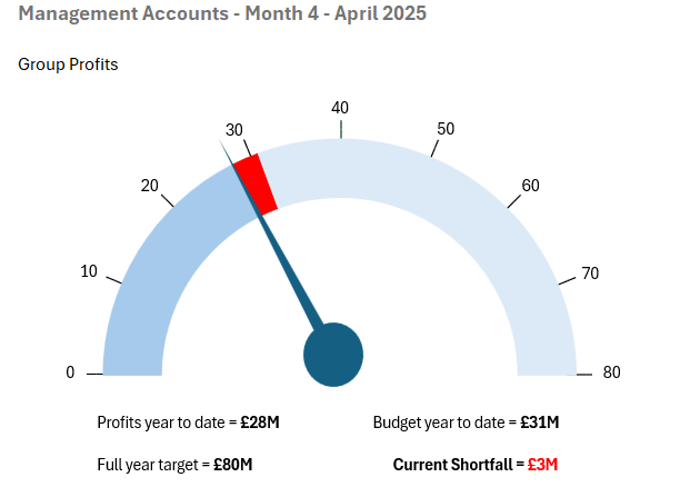
In this fourth blog we will look at ways to report achievements of plans in the form of a speedometer. It’s a graphic that should be used sparingly so one or two of them have impact rather than a cluster of them where it becomes difficult to conclude the relative importance of each. They are ideal for reporting achievement of KPIs or year to date progress against targets. The more details added to the dial the easier it is to interpret. A plain dial is just a proportional assessment, a calibrated dial enables interpretation. The blog will explain how to draw the example below.
Structure
A speedometer is not a function available in Excel it has to be built out of the available components. The construction is half a Doughnut Chart from the Chart options, a Speech Bubble (Oval) from the Shapes options and a few Text Boxes.

Preparing the data
To draw the chart we only need half the doughnut, the other half will have ‘No fill’ as its colour making it invisible. The data for the speedometer above is the series:
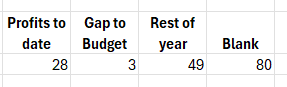
NB the blank amount must be the sum of the other three so that it will represent half the doughnut.
Drawing the Doughnut
Highlight the dataset and click on the Doughnut chart in the Charts area of the Insert Ribbon. It will display as the circle shown above. Right click the Doughnut and select Format Data Series to reveal the options below.
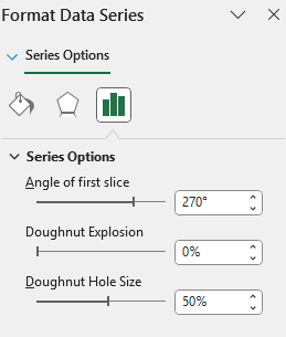
Angle of first slice. To get the arc commencing at the ‘9 O’clock’ position set this to 2700 (12 O’clock is 00 rotating clockwise).
Dougnut Explosion. This is used to pull the ‘slices’ out from the circle and is not required here – set this as Zero
Doughnut Hole Size. To widen the display make this 50%
You can now select your colours for each segment, select ‘No fill’ for the bottom half and also ‘No Fill’ for the Border colour too. The chart should now look like this:

Drawing the Speech Bubble
From the Insert Ribbon select Shapes in the Illustration area and then choose ‘Speech Bubble: Oval’ from the Callouts section. Draw a circle and extend out the ‘tail’ to form the speedometer needle. Select your colour and again set the Line (around the edge of the Speech Bubble) to ‘No fill’. Take time to line the Speech Bubble up in the middle of the dial and point it in the right place.

Calibration
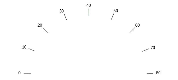
To enable the dial to be read more easily it can be helpful to put a calibration scale around. This is easily achieved although a little fiddly to do so. Essentially it is another half doughnut with a set of narrow segments to provide the markings. In our example we want the dial to go up to £80 million so if we want to start at 0 we will need nine marks for each £10 million and also 8 gaps.
Run a data series along with 0.2 as the mark and 12.3 as the gap. At the end have a total equal to the sum of all the values. In the example below you will see I have hidden columns Q to X and the series adds to 100.2.

Finally bring the two doughnuts together. Start by selecting the calibration chart and on the Chart Format Ribbon select ‘Send to back’ in the Arrange area. This will mean as you join the two doughnuts, the coloured one will sit in front of the calibrations.
Select the coloured Doughnut, right click and select ‘Format Plot Area’ and set the chart Back Color to ‘No Fill’ (essentially making the back of the chart transparent) so you can see the grid behind. Next resize the coloured doughnut so it is slightly smaller than the calibrated doughnut. Now move the coloured doughnut and the needle over the top of the calibration doughnut to complete the Speedometer.
Producing this chart in future months is much easier – you just update the data for year to date profit etc and then realign the needle.
Questions from the webinar
There were three questions raised in the webinar that are not already covered above or will be covered elsewhere in the series.
Q1 – Do you need to Group the components?
There is no need to Group the components, but it can be helpful to group the Text boxes on the calibration doughnut to avoid them slipping out of alignment.
Q2 – How do I automate the text around the dial
Unfortunately, there is no quick way to do this automatically, it is a series of Text Boxes that can take a while to line up and position appropriately. When doing this it can be helpful to Zoom in to a larger scale 150% or more and thus make the accuracy of lining up easier to complete.
Q3 – How do I put transfer this chart into PowerPoint
In Blog 2 we mentioned how to place a chart in PowerPoint. Which was to paste it as an Image not as a linkable spreadsheet. As this graphic is constructed out of a number of components, I recommend doing a simple Function Screen Print and using the Snipping Tool to take a screen grab of the chart and place as an image into PowerPoint.
- Bringing financial reports alive in Excel with visualisation
- Bringing financial reports alive in Excel with visualisation – visualising monthly results
- Bringing financial reports alive in Excel with visualisation – comparing data sets
- Bringing financial reports alive in Excel with visualisation – speedometers
- Bringing financial reports alive in Excel with visualisation – building the report
Archive and Knowledge Base
This archive of Excel Community content from the ION platform will allow you to read the content of the articles but the functionality on the pages is limited. The ION search box, tags and navigation buttons on the archived pages will not work. Pages will load more slowly than a live website. You may be able to follow links to other articles but if this does not work, please return to the archive search. You can also search our Knowledge Base for access to all articles, new and archived, organised by topic.
