
Building the report
In this final article of the series, we will pull together all the visualisations and complete the financial board report.
The purpose of the report is to provide the board members and senior management with the necessary financial information and analysis to enable informed decision-making. and to facilitate effective oversight of the organisation's financial performance and strategy. However, if you look at the evolution of any financial board report, typically it has been developed piecemeal, with additional information periodically added (and rarely thinned out). The key messages have been lost, and a non-financial person can feel overwhelmed with a maze of papers that lack any form of coherence.
What does the financial board report need to show? Perhaps three key things:
- How are we progressing against plan
- Some of the key numbers to provide context and scale
- Analysis support for the key decisions required
Before getting into the numbers, some thoughts on the commentary. It is here that a financial board report can dramatically fail. Too often I read a variance summary that might say ‘We are £X,000 below budget for sales’ and then go on to comment on the variance for another area. This just leaves the reader thinking ‘Why? What are we doing about it? And when will be back on track?’ Effectively the report says in words what was clearly evident from the variance column on the income statement, but without adding any value.
A better commentary provides five levels of analysis:
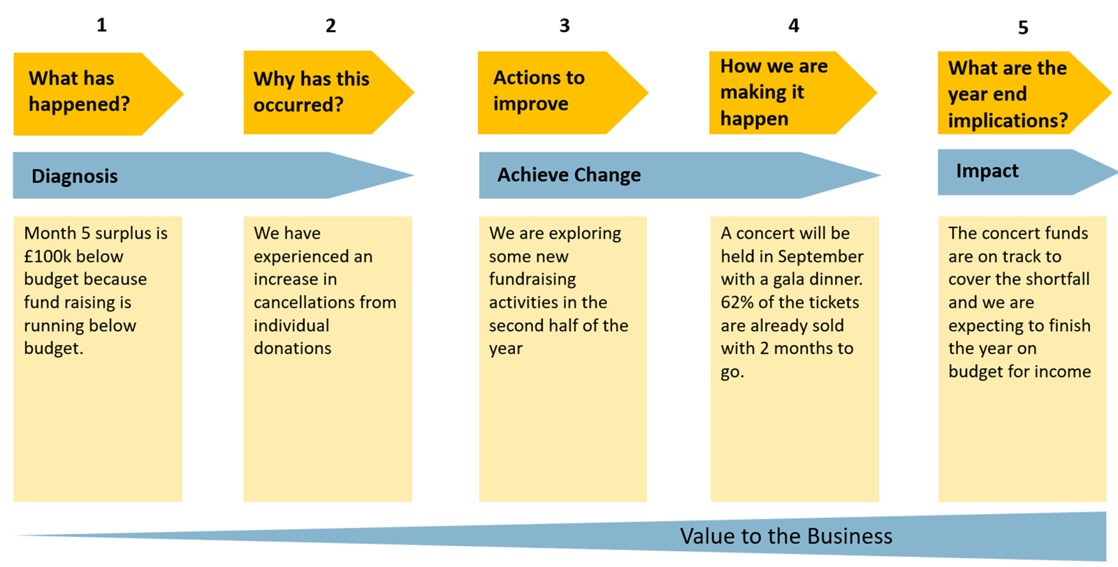
Levels 1 and 2 are what has happened and why did this occur. This is historic looking fact and context.
Levels 3 and 4 explain what actions we are taking in response to the budget variances. Level 4 describes where we have reached in implementing the actions identified in Level 3.
Level 5 gives a sense of when we can expect the actions to deliver their benefits and the implications for the year end.
If all five levels are explained succinctly in the commentary, you have a comprehensive report that answers questions rather than raises them.
The front page
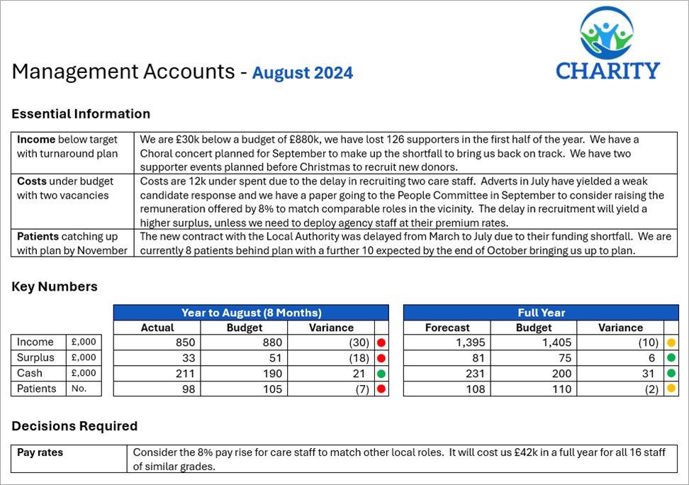
Below is an example front page of a financial board pack:
Landscape
Producing the whole pack in landscape makes it much easier to accommodate the multiple columns needed for the financial statements on later pages (income statement, cash flow etc…). It also avoids readers having to turn around the pages from landscape to portrait (and back again) as they work through the document.
Commentary
Use a table format – headlines on the left and detail on the right. This allows board members (who may not have read the papers in detail – or at all) to quickly be up to speed with the key messages.
Key numbers
Align these to the group KPIs and use the principle explained in the first article of a few significant digits rather than having detailed numbers here. Traffic lights aid being able to determine the areas on track and those that have veered away. Always make sure the red lights are explained in the Commentary above.
Decisions required
Note here the decisions required by the board and provide the supporting papers. Always include a recommended course of action for each decision rather than leaving it open to the board to decide.
Supporting pages

Complete a detailed income statement, balance sheet and cash flow, using traffic lights to highlight those variances that have deviated from budget.
The features here are blocks for the month, the year to date and the full year. In both the month and the year-to-date blocks, the six columns are the numbers for budget, actual and last year. Also shown are the variances between budget and actual as well as actual and last year. Finally, traffic lights highlight the significant variances to the budget.
There are two ways of presenting variances:
- Positive is good news and negative is bad news – this is the version that most non-financial people can interpret most easily.
- The other method is: positive is bigger than budget and negative is smaller than budget. The problem with this method is that positive (bigger than budget) is good news for income and bad news for costs.
The percentage variance is not shown as a number here. Instead, it is represented by the traffic light:
- Red is more than 10% worse than budget.
- Green is more than 10% better than budget.
- Amber is within 10% of budget.
With a multi column table it is important to keep the font size large enough to make it legible. 14 columns are about the maximum. Thus, replacing the percentage variance with a traffic light not only highlights the key issues but also is a narrower column.
The final block includes the budget and last year, but also a forecast. Some organisations formally produce a reforecast quarterly; others keep them rolling for the next 12 months. The benefit of this column is to take into account a changing world from when the budget was assembled.
At the bottom of the table are the 5 largest variances. The Excel functions that can be helpful to pull out the variances are:
- =LARGE (Array, Position) – this finds the largest items (top 5 best variances – with the largest positive as Position 1).
- =SMALL (Array, Position) – this finds the smallest items (the worst 5 variances – starting with the largest negative variance as Position 1).
- =XLOOKUP (Lookup value, Lookup array, Return array) – this can be used to find the variance description of the large and small percentages identified above.
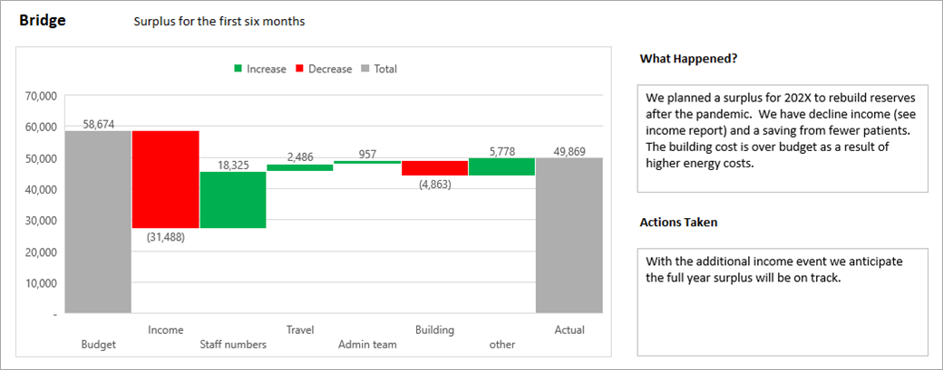
It can be helpful to explain the difference between budget and actual in the form of a Bridge chart (see article 3 in the series). This is by theme, not by line item of the income statement. In other words, what has caused the change rather than where did the change impact the income statement. For example, the increase in National Insurance will affect the payroll of all departments. Show this as one block for the entire impact on the organisation rather than a series of blocks for each department.
Include other supporting schedules to show forecasts and plans, including other charts (article 2) and Speedometers (article 4). Be careful with these: a chart is only useful if it can clearly convey a message. A chart that takes more than a minute to interpret needs simplifying and summarising. A quote from ASC Ehrenberg was included in the second article
In a world of visualisation, don’t be afraid of tables of data. Not everything should be communicated by a chart. Sales and profit of divisions are ideal for a table. However, sort the table by size (not alphabetical), as it makes it easier to see the dominant parts of the group compared to the rest.
When implementing the ideas shared through the series, do seek feedback from your client group – the board or senior managers. What do they find most helpful? What parts don’t they read or use? And what else would be useful to them? On that final point of additional items, try asking ‘why’ as well as ‘what’ – you may be able to suggest a better means of fulfilling their request.
- Bringing financial reports alive in Excel with visualisation
- Bringing financial reports alive in Excel with visualisation – visualising monthly results
- Bringing financial reports alive in Excel with visualisation – comparing data sets
- Bringing financial reports alive in Excel with visualisation – speedometers
- Bringing financial reports alive in Excel with visualisation – building the report
Archive and Knowledge Base
This archive of Excel Community content from the ION platform will allow you to read the content of the articles but the functionality on the pages is limited. The ION search box, tags and navigation buttons on the archived pages will not work. Pages will load more slowly than a live website. You may be able to follow links to other articles but if this does not work, please return to the archive search. You can also search our Knowledge Base for access to all articles, new and archived, organised by topic.
