
Waterfall Charts
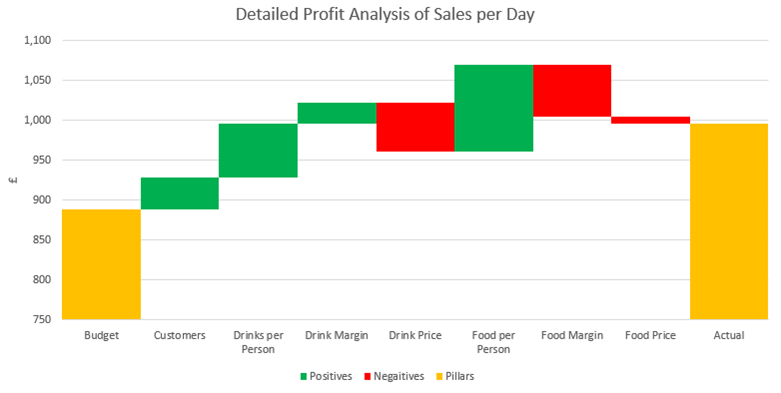
In this third article, we will look at ways to compare two data sets (for example Budget to Actual or Last Year to This Year). We will display the reasons for why the two sets of values differ by displaying them as Waterfall Chart, sometimes known as a Bridget Chart or Cascade Chart. The article will explain how to draw the example below.
Up to 2016, these charts were only possible by using a stacked Column Chart and then setting the Fill for the base blocks to No Fill, and thus leaving the upper blocks ‘floating’ in mid-air. The built-in Waterfall Chart in Excel is a much quicker way of creating this chart, especially if the data should cross the horizontal axis and go negative at any point.
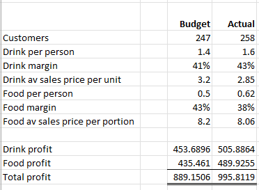
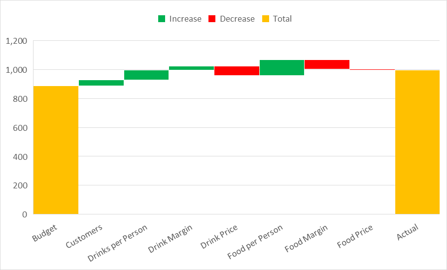
The following data is used for our example – it is a pub restaurant showing the causal factors to explain the reason for a profit achievement above budget. When designing these charts, it is helpful to limit the number of columns to around 10. More than this and the detail detracts from the clarity of message (ie, focus on the main reasons for difference). In limiting the number of columns, it may be tempting to group all the smaller values into one single column called ‘Other’. Be careful this ‘Other’ column does not become the largest reason for difference and thus need an explanation of its components.
Calculating the variances
In comparing the two columns, the analysis technique is to isolate each of the variables in turn. Start by calculating the Total Budget Profit (£889.15). This is done by multiplying the Customers number (247) by the three drink factors (1.4 X 41% X £3.20) and then add to the same Customers number (247) multiplied by the three food factors (3.2 X 0.5 X 43%). Repeat the process to calculate the Total Actual Profit (£995.81).
To isolate each variable in turn, simply repeat the calculation that started with all budget numbers, and then one by one switch the budget numbers to actual numbers. Once a variable is switched to actual, then keep it as an actual. To identify the effect of the pub having 11 more customers (247 rising to 258), multiply the actual Customers number by the budget values for the three drinks and the three food factors. (258 x 1.4 X 41% X 3.2)+(258 X 0.5 X 43% X 8.2) = 928.75. The difference caused by a change in customer numbers is therefore £928.75 - £889.15 = £39.60.
To calculate the variance caused by customers consuming more drinks than budget, start with the actual Customers and multiply it by actual Drinks per person and the budget values for the remaining items. (258 x 1.6 X 41% X 3.2)+(258 X 0.5 X 43% X 8.2) = 996.44. The difference caused by a change in the number of Drinks per person is therefore £996.44 - £928.75 = £67.69.
Continue the process with each variable, until all of them are switched to actual.

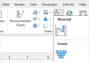
Drawing in Excel
Highlight the block of cells shown above (including the headers above each causal factor) and select the Insert Ribbon. In the Charts section, click on the Waterfall Chart as shown below.
The result will display as follows:
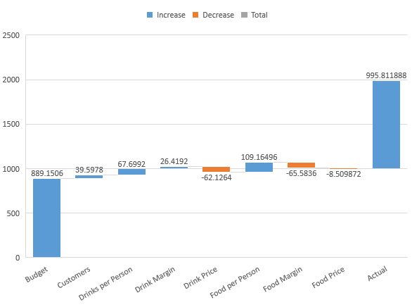
At first take, it does not resemble the chart displayed at the start of this blog. We now need to make several adjustments as follows:
Define Totals
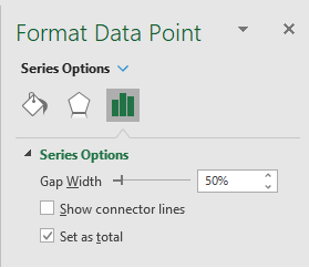
The chart needs to have the pillars established at each end – in Excel, these are called ‘Totals’. To set these, double-click one of the two end columns, pause a moment and then single-click it. This will highlight the single column and make all the other columns become faded out. In the right-hand menu bar, select the ‘Set as total’ check box. Repeat the process for the other end column.
At this point, it can be helpful to set the Gap Width as 0% to join the columns together. Whilst the ‘Set as Total’ applies to the individual column selected, the Gap Width will apply to all columns.
If you want to remove the datapoint values, click on any single value and all the values will all become selected; finally, press delete.
To change the colours of the three attributes, the easiest way is to click on the coloured squares in the legend. This will highlight all the bars of that colour (for example all the increases) and fade out the rest. Using the tipping paint pot in the menu on the right, select your colours.
The chart will now display as follows:
Axis bounds
As with many charts, the action occurs in only part of the chart, and there can be a lot of white space unnecessarily included. The way to remove this is to reset the Axis Bounds.
Right click the vertical axis and from the options select ‘Format Axis’. In the menu on the right, you will see Axis Bounds (Minimum and Maximum). You will also see the word Auto to the right of the values. Auto means Excel is automatically calibrating the axis to fit the data it is being fed. You can override this and set the values manually. In this case we will use 750 as our Minimum, as none of the bars fall below this value.
Once overridden, you will have locked the axis, and if new data is fed into the chart, you have two options to recalibrate the values. Firstly, go back to the Axis Bounds and enter a new Minimum value; or secondly, when a value is entered, the word ‘Auto’ will be replaced by a Reset button, and pressing this will switch the axis back to Auto for you.
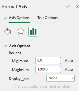
Be careful with this feature – while it can help focus on the differences, it can also make their impact seem disproportionate. In this example, most variances have no more than 5% impact; yet when the chart is focused in, these variances can seem to have much more significance.
Your questions answered
There were two questions raised that are not already covered above or will be covered elsewhere in the series:
What if variances go negative – can it cope?
The simple answer is ‘Yes’ – the bars will drop below the horizontal axis, and should the results turn positive again, they will rise back above the axis too.
How do you get the category descriptions to wrap rather than be on one long line?
The answer is: when typing your description, instead of using a space between words, use ALT and Enter together. This will force a line feed and put the next word on the next line for you.
- Bringing financial reports alive in Excel with visualisation
- Bringing financial reports alive in Excel with visualisation – visualising monthly results
- Bringing financial reports alive in Excel with visualisation – comparing data sets
- Bringing financial reports alive in Excel with visualisation – speedometers
- Bringing financial reports alive in Excel with visualisation – building the report
Archive and Knowledge Base
This archive of Excel Community content from the ION platform will allow you to read the content of the articles but the functionality on the pages is limited. The ION search box, tags and navigation buttons on the archived pages will not work. Pages will load more slowly than a live website. You may be able to follow links to other articles but if this does not work, please return to the archive search. You can also search our Knowledge Base for access to all articles, new and archived, organised by topic.
